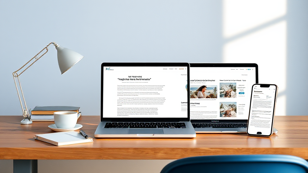
How Blogger Template Design Shapes Readability and Search Performance
Readers decide in seconds whether to stay on your blog, and that decision is made before any crawler reads a single word. Layout, typography, and spacing are doing quiet SEO work long before Googlebot arrives. If you want to improve dwell time and the engagement signals search engines infer, start by treating your template as a reading environment, not just a container for posts.
This walkthrough is for bloggers who care about craft. We will look at how specific design choices in blogger templates affect readability, attention, and the behavioral clues that search systems use to judge page quality. Then we will compare a before-and-after reasoning process you can apply to your own blog.
Why Layout Is an SEO Input, Not Just a Visual Choice
Search engines cannot measure how pleasant your blog feels, but they can measure what visitors do. When a page loads and readers immediately bounce, that pattern suggests the content did not meet the promise of the title. When readers scroll, click related posts, and return to the site later, those behaviors hint at satisfaction. Layout is the lever that makes those behaviors more likely.
The key idea is that readability is a ranking asset. A clean template reduces friction between the reader and the content. That friction can come from cramped line spacing, low-contrast text, cluttered sidebars, or images that push the article below the fold. Each of these issues makes it harder for a visitor to start reading, and harder still to keep reading.
This does not mean you need a perfect design. It means you need a template that gets out of the way. The best Blogger templates are not the ones with the most features; they are the ones that make the article the hero of the page.
The Typography Decisions That Keep Readers on the Page
Typography is the first thing readers feel and the last thing they consciously notice. A comfortable reading experience depends on a small set of decisions that are easy to get wrong when you are choosing a template.
Font size and line height
Body text below 16 pixels forces many readers to zoom, and zooming is friction. A line height between 1.5 and 1.7 times the font size gives paragraphs room to breathe. If your template uses tight line spacing to fit more content above the fold, you are trading readability for a metric that does not matter as much as finishing the article.
Line length and measure
Lines that stretch across a wide desktop screen exhaust the eye. A measure of roughly 60 to 75 characters per line is comfortable for long-form reading. Templates that constrain the article column while letting images break out to full width often strike the best balance.
Contrast and color
Dark gray text on white is easier to read than pure black, which can feel harsh, but low-contrast gray on gray is a readability failure. Check your template’s default text color against the background. If you have to squint, so will your readers, and some will leave rather than try.
Whitespace, Hierarchy, and the Signals They Send
Whitespace is not empty space. It is the structure that tells readers where to start, what matters, and where to pause. A template that respects whitespace makes even a long article feel approachable.
Headings as visual anchors
Clear heading hierarchy helps readers scan. If your H2 and H3 styles look nearly identical, readers cannot build a mental map of the article. Search engines also use heading structure to understand topic relationships, so visual hierarchy and semantic hierarchy should agree.
Spacing between sections
Generous margins above headings and between paragraphs create rhythm. Cramped spacing signals density, and density signals effort to the reader. Whitespace lowers the perceived cost of reading, which makes starting and continuing more likely.
Sidebars and secondary elements
Every widget competes with the article for attention. A template with a narrow, well-organized sidebar keeps focus on the content. A template with three columns of ads, tags, and social buttons creates visual noise that pushes readers away before they begin.
Image Weight, Speed, and the First Impression
Images are essential for modern blogs, but they are also the most common cause of slow templates. Large hero images and uncompressed thumbnails delay the moment when readers can actually read. That delay is measurable, and it affects both user behavior and how search engines evaluate page experience.
Choose a template that lazy-loads images below the fold and serves properly sized thumbnails on archive pages. On article pages, keep the featured image meaningful but not oversized. A fast template is not a luxury; it is part of the reading experience. If you are comparing options, look for templates that advertise fast-loading and responsive design as core features rather than afterthoughts.
Image weight also affects layout stability. When images load without reserved space, the page shifts and readers lose their place. Templates that set image dimensions in advance feel calmer and more professional.
A Before-and-After Reasoning Walkthrough
Here is how a designer-turned-blogger might evaluate a template change without relying on guesswork. The goal is to reason from reader behavior, not from taste alone.
- Before: The blog uses a wide single column, 14-pixel body text, and a full-width hero image on every post. Readers land, see a large image, and must scroll to reach the first sentence.
- Diagnosis: The first screen is doing visual work but not reading work. The article begins too late, and the text is small enough to require effort.
- Change: Switch to a template with a constrained article column, 18-pixel body text, and a smaller featured image placed after the introduction.
- After: The first paragraph is visible immediately. Readers can start reading without scrolling, and the page feels lighter.
- Reasoning: The improvement is not about aesthetics alone. It shortens the distance between arrival and reading, which is the moment when engagement begins.
This same reasoning applies to sidebars, related-post blocks, and comment sections. Each element should earn its place by helping the reader continue, not by distracting from the article.
Choosing and Customizing Blogger Templates with SEO in Mind
When you evaluate blogger templates, look past the demo screenshot. Check how the template handles body typography, heading hierarchy, mobile layout, and image loading. A template that looks good in a preview may still have cramped defaults that you will need to fix.
Good template shops provide documentation and video tutorials, which matter more than most buyers expect. Customization is where design decisions become real. You will need to adjust font sizes, spacing, and widget placement to match your content. A template with clear documentation makes those changes faster and less error-prone.
Also consider AdSense-friendly layouts if you plan to monetize. Ads should not interrupt the reading flow or push the article below the fold. The best templates reserve ad space without letting it dominate the page. Responsive behavior is equally important: mobile readers need the same comfortable typography and clear hierarchy as desktop readers.
Finally, test before you commit. Load a few posts, check the first screen on a phone, and read a full article yourself. If you find yourself scrolling past clutter to find the text, your readers will too.
Frequently Asked Questions
Do Blogger templates really affect SEO?
They affect the conditions that influence SEO. A clean, fast, readable template supports engagement and page experience, while a cluttered or slow template creates friction that can hurt both. The template is not a ranking factor by itself, but it shapes the signals search engines observe.
What is the most important design choice for readability?
Body text size and line height. If readers have to zoom or strain, nothing else in the design matters. Start with comfortable defaults, then refine spacing and hierarchy.
Should I use a free or premium Blogger template?
Free templates can work well if they are well coded and documented. Premium templates often include better support, cleaner code, and more customization options. The right choice depends on how much control you need and whether you plan to monetize.
How do I know if my template is too cluttered?
Open a post on a phone and count how many elements compete with the article before the first paragraph. If the answer is more than one or two, simplify. Readers should meet your words first.